福特的用戶研究負責人表示,公司正在努力確保駕駛員理解ADAS和其它控制系統,但這項工作依然任重道遠。
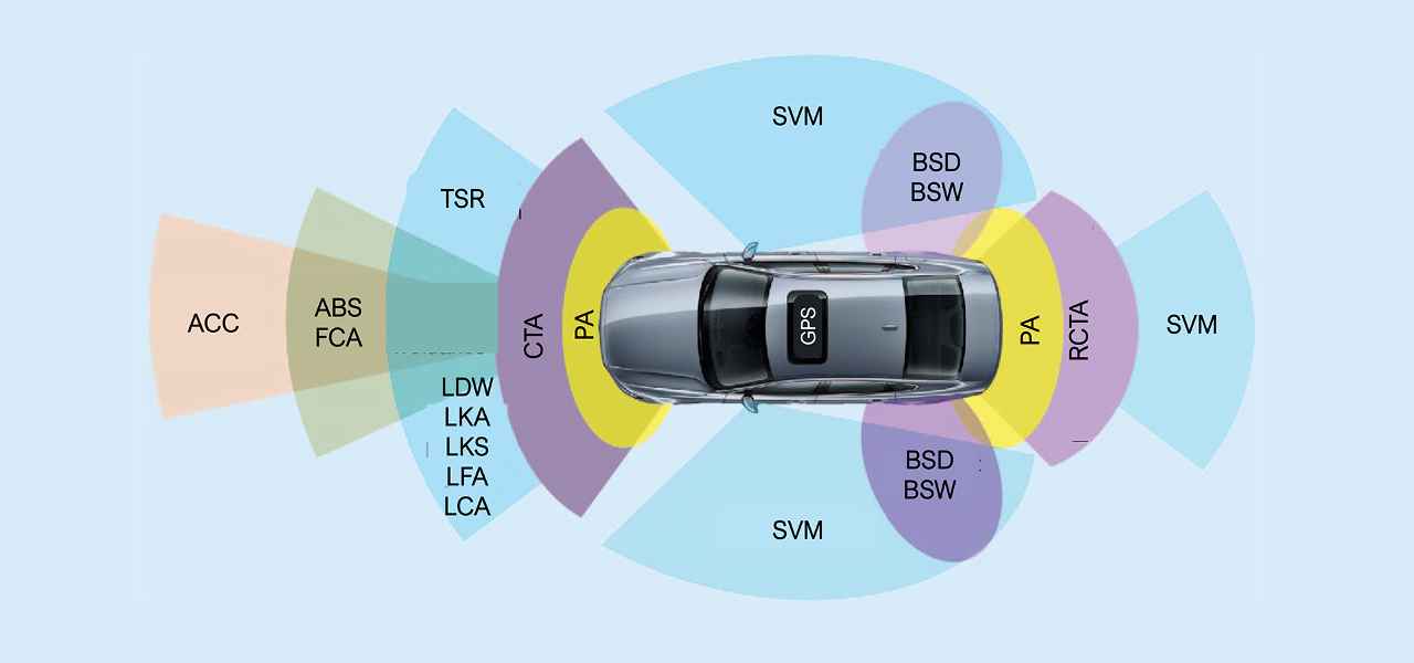
今年5月,福特用戶研究負責人Susan Shaw在底特律舉行的InCabin USA汽車內飾技術展上表示,ADAS功能、控制和指示圖標使用的字母極其繁復,而且不同車型之間并不一致,這時常令駕駛員感到困惑。Shaw舉例說明,LDW、LKA、LKS、LFA、LCA等首字縮寫詞都代表了與車道相關的功能。而且這些詞的用法并非全行業統一,因為一些OEM對類似的技術有自己的命名方式。這些因素都可能導致駕駛員做出錯誤的判斷,從而陷入危險。她表示:“我們在調查中發現了一個令人震驚的情況:許多用戶認為其車輛會在緊急情況下剎車,但實際上這些汽車并未安裝此類系統。”
在深入介紹其用戶體驗調查之前,Shaw首先以“唐諾曼門(Don Norman Door)”作為一個經典案例簡單介紹了一下控制與指示圖標這一主題。其中,“諾曼”為《日常物品的設計》(“The Design of Everyday Things”)一書的作者。所謂的“諾曼門”指的就是任何令用戶感到困惑,或未能按其預期開關的門,例如一扇沒有任何說明,用戶不知應該推、拉或滑動才能打開的門,或者即便有標簽或圖標也不一定能看明白的情況。
Shaw也是SAE控制與顯示標準委員會成員。他提到,委員會的目標之一就是盡可能推動OEM之間實現圖標標準化。她指出了目前面臨的一個問題:“OEM希望保持其獨特的設計風格,讓用戶一坐上車就能夠認出這是梅賽德斯還是福特,不會產生混淆。各品牌的車輛的確應該具有不一樣的外觀和內飾,但問題是,我們能否令車內的圖標和按鍵變得更容易理解?”Shaw 以巡航控制按鍵和圖標為例進行說明:“在我們調查的所有車型中,除了兩款外,其他幾乎所有車型的巡航控制按鍵都采用了速度計的圖形。其中有一款采用了我稱之為‘棒棒糖’的圖形,但實際上更像是交通標志;另有一款采用了汽車圖形,當然,還有幾款采用了箭頭圖形。這些按鍵都是用來啟動各種自適應或普通巡航系統的,如福特BlueCruise和凱迪拉克Super Cruise。更加令人困惑的是,當駕駛員打開系統界面后,屏幕上呈現的又是其他內容。”其中一些顯示的是巡航系統的啟動或運行狀態,而另一些則會顯示設定的速度。Shaw表示:“它們基本上完全不一樣。如果駕駛員正駕駛著一輛租賃的汽車,他能正確辨認這一功能是開啟還是關閉的嗎?”
Shaw還指出,一些車輛的ADAS設置菜單非常繁瑣。例如,在一輛汽車上,可能只需按兩下按鍵即可調整制動的靈敏度,但在另一輛車上可能就需要更多操作,而且這些設置可能放在不同的菜單名稱下,如“駕駛輔助”或“其它設置”。
Shaw建議所有OEM的研發團隊汲取用戶體驗(UX)領域的專業知識和經驗,包括在研發過程中將用戶測試盡可能常態化,連那些看似是“常識”的方面也應經過這樣的測試。她引用了伏爾泰的名言:“常識其實并不尋常。”
為了說明圖標引起的混亂問題,Shaw分享了她78歲父親的經歷。她說:“英語不是我父親的母語。他曾告訴我,方向盤上有個按鍵他從未用過,因為他以為那是Wi-Fi按鍵,但實際上那是語音識別按鍵,只是和家里的Wi-Fi圖標采用了相同的弧線設計。我本想解釋:‘Wi-Fi圖標的弧線是向上延伸的,而這個是向側面延伸的。’但對于78歲高齡的駕駛員而言,這對他幫助并不大。他擔心按下按鍵需要支付Wi-Fi費用,因此不肯使用這項功能。”
Shaw向老年和新手駕駛員推薦由美國國家安全委員會(National Safety Council)運營的“我的汽車有哪些功能(My Car Does What)”網站。但她也同時強調,隨著這些知識的普及,駕駛員對此類網站的需求將會減少。她表示,一名優秀的用戶體驗研究員除了致力于促進相關各方統一對車輛控制和指示圖標外,還應周全考慮語言問題、消除地區和民族文化差異,從而避免駕駛員對車輛功能的誤解和誤操作。在OEM車型日益全球化的背景下,解決這些問題就愈加重要了。
At the InCabin USA interior vehicle technology expo in Detroit in May, Ford customer research lead Susan Shaw said that the sea of letters around ADAS features and control and indicator icons that vary between vehicles are often confusing to drivers. Shaw pointed out that the following all represent features related to driving lanes: LDW, LKA, LKS, LFA, LCA. These initialisms (“acronym” only refers to groups of letters that form words) are not the only ways the industry refers to these technologies, as some OEMs have their own names for similar things. It all contributes to what can be dangerous assumptions on the part of a driver. “It’s shocking how many people think their vehicle will apply the brakes in an emergency, when the car has no such system,” she said.
As an overview to the subject of control and indicator iconography, Shaw began with an introduction to user experience research by talking about a classic example: The “Don Norman door.” Norman is the author of “The Design of Everyday Things.” A so-called Norman door is any door that is confusing or does not open or close as a user expects it to. For instance, an unlabeled door that a user does not know whether to push, pull or slide to gain entry. And labels or icons don’t necessarily help things.
Shaw, a member of the SAE committee on controls and display standards, said one of the group’s goals is to standardize icons – as much as possible – across OEMs. One problem, she said, is that “OEMs want to have their own design. You want to get in a car and know it's a Mercedes or know it’s a Ford. You don't want to be confused between the two. It should look different. It should feel different. But can we make these icons and buttons [more recognizable]?” Shaw cited cruise-control buttons and indicators as one example. “All of them seem to have a speedometer icon, except for two. And then one of them has what I call a lollipop. It’s actually a traffic sign. One of them has a car; a couple have arrows. All of these are the button you use to turn on cruise control, BlueCruise, Super Cruise, whatever cruise you're working on, adaptive or not. And then when you get into the screen, they all show you something different.” And then, some of them mean cruise is on and engaged, and some indicate the speed that is set. “They’re mostly all different,” she said. “If you’re getting in a rental car, do you know that the feature is engaged?”
Shaw also mentioned the byzantine nature of some vehicles’ ADAS settings menus. For instance, while it might take two button presses on one vehicle to adjust the sensitivity of forward braking, it can take far more on another. And they may be behind different menu names, such as “driver assistance” or “additional settings.”
Shaw advocated for all OEMs to include deep UX expertise and experience on their development teams, including near-constant user testing, even for things that appear to be “just common sense.” “We find repeatedly that common sense isn’t common,” she said, quoting Voltaire. For an example of iconographic confusion, Shaw pointed to her 78-year-old father. “English is not his native language,” she said. “And he told me there’s a button on the steering wheel he’s never touched because he thinks it’s the Wi-Fi button. Well, it’s the voice recognition. It's got the same arcs as the Wi-Fi thing at home does. I'm like, ‘Well, those go up, these go out.’ But to someone who's 78, that’s not enough of a distinction. He’s afraid he’s going to have to pay for Wi-Fi, so he refuses to touch the button.”
For older drivers and those new to driving, Shaw recommend the website My Car Does What?, managed by the National Safety Council. But, she emphasized, with commonization, the need for such a site would be reduced. In addition to helping reach a common understanding of vehicle controls and indicators that work, Shaw said a good user experience researcher will attempt to balance not only language issues but also regional and ethnic cultural differences that could lead someone to misinterpret or misuse a vehicle feature. Especially in an era in which OEMs are producing more “global cars” than ever.
In addition to helping reach a common understanding of vehicle controls and indicators that work, Shaw said a good user experience researcher will attempt to balance not only language issues but also regional and ethnic cultural differences that could lead someone to misinterpret or misuse a vehicle feature. Especially in an era in which OEMs are producing more “global cars” than ever.
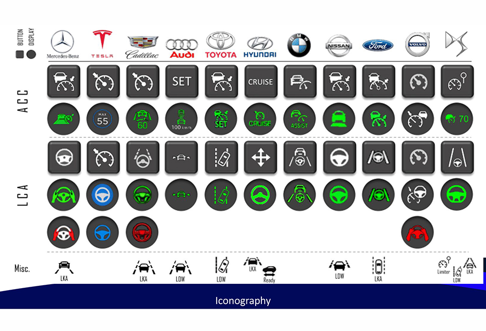 福特的Susan Shaw是一名經過認證的專業人機工程學專家,她說,雖然設計師希望按鈕和圖標足夠獨特,以提示你是在奔馳車上而不是雪佛蘭車,但仍有余地將它們通用化,以促進人們普遍理解它們的含義。自 2022 年編制本圖表以來,部分圖標已經更新。(福特/ Susan Shaw)
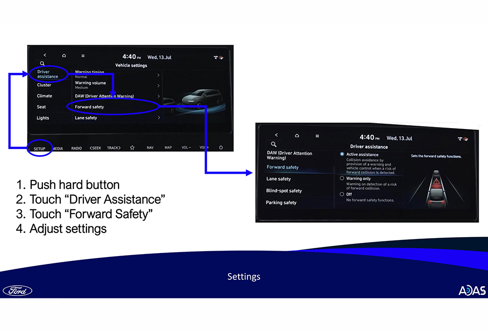 要更改ADAS設置,少則兩次,多則按八次按鈕才能到達正確位置。(福特/ Susan Shaw)
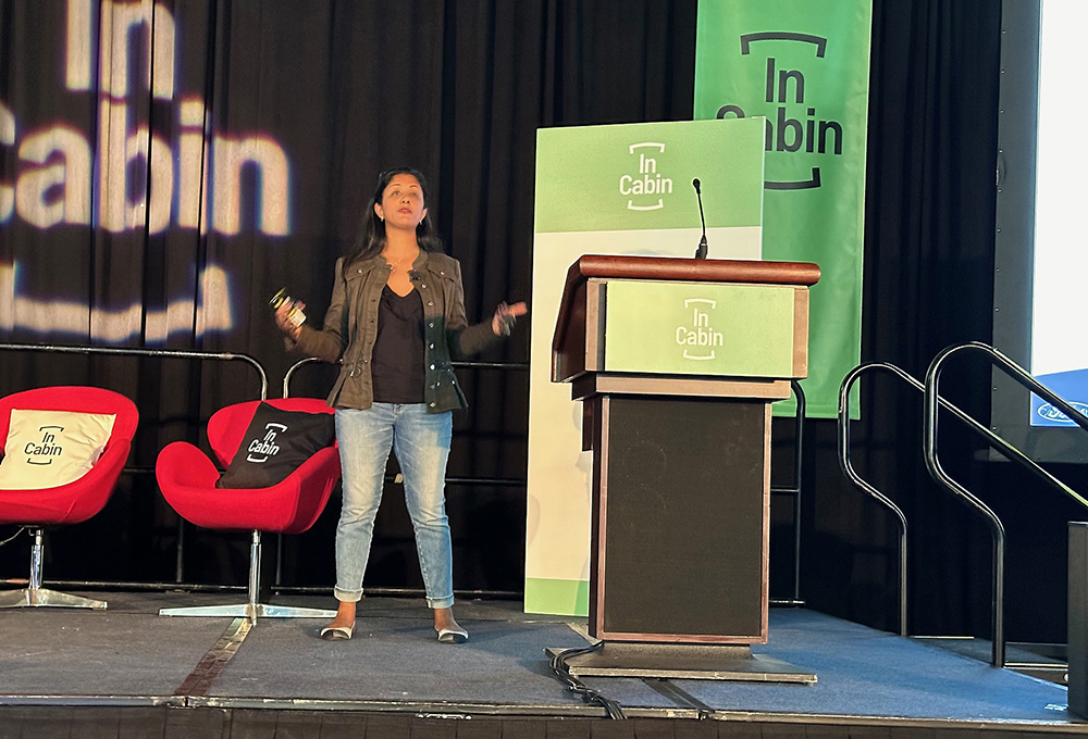 福特的用戶研究負責人Susan Shaw是SAE控制和顯示委員會的成員,該委員會正致力于推動使用統一的按鈕和圖標。(CHRIS CLONTS)